Web analytics dashboard
Prisme Analytics comes with a built-in web analytics dashboard, that focus on measuring and analyzing anonymous traffic in order to understand how to maximize conversion.
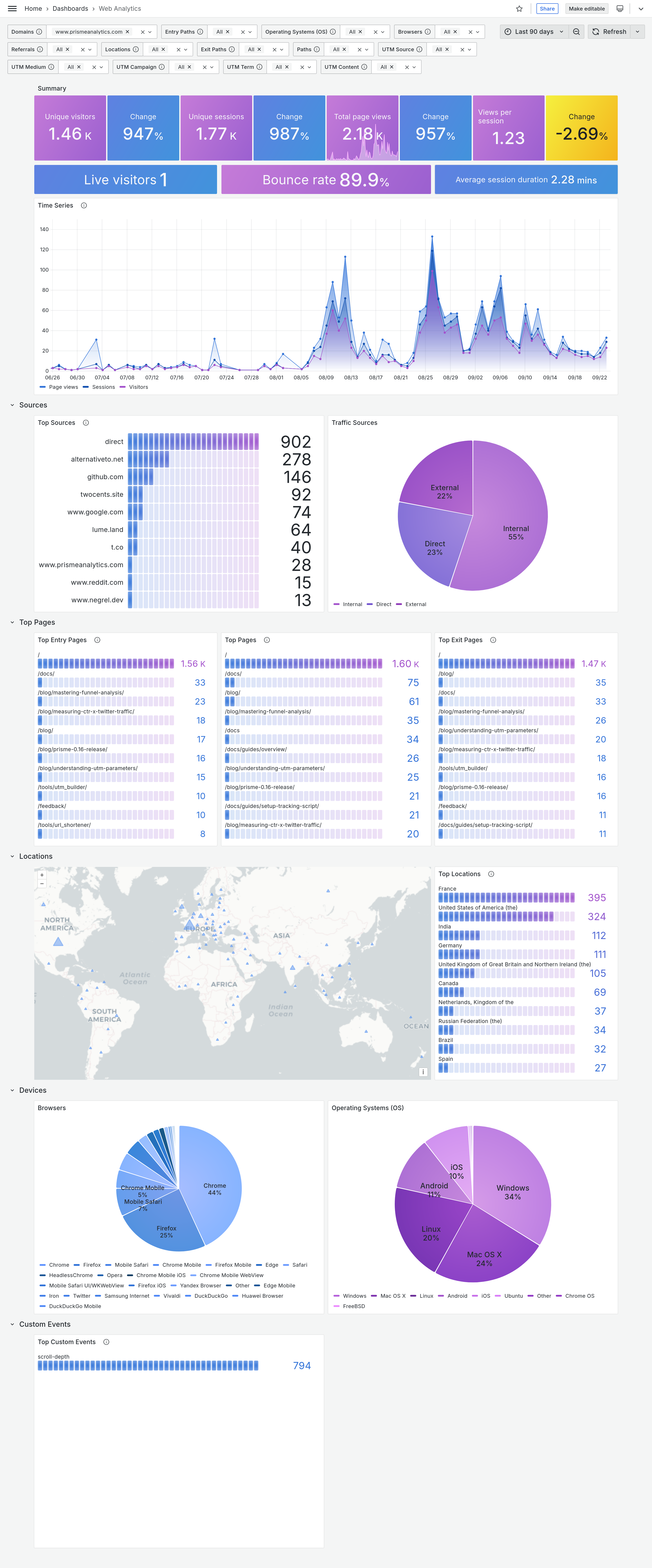
This document introduces and explains every panel of this dashboard:
Parameters
Parameters section influences how your analytics data are retrieved and displayed.
It enables you to filter traffic data and visualize only what you want/need. Here is a screenshot of 14 parameters of general dashboard:

- Date time range: The specific time period we want to visualize
- Domains: Website domain names
- Entry Paths: Paths of first pages viewed by a visitor within a session
- Operating Systems: Visitors' Operating System family
- Browsers: Visitors' browser family
- Referrals: Domain from which page was visited or
direct - Locations: Visitors' country
- Exit Paths: Paths of last pages viewed by a visitor within a session
- Paths: Paths of visited pages.
- UTM parameters (source, medium, campaign, term, content): Session started with the given UTM parameters
Overview section
First section is made of 3 panels with common metrics you would expect on any web analytics dashboard. It is designed to provide a quick overview of you website traffic.
Summary panel

Summary panel is made of metrics and Change block.
- Unique visitors: Number of people who visited your website
- Unique sessions: Number of sessions (or visits)
- Total page views: Total number of times your pages were loaded by your visitors
- Views per session: Average number of page view per session
The Change values represent the percentage change from one time period to
another within the metric. For instance, if your dashboard displays data for the
last 7 days, the Change value for unique visitors would indicate the
percentage difference between the current 7-day period (green rectangle) and the
previous 7-day period (blue rectangle).

Summary panel 2

Second summary panel shows more advanced metrics.
- Live visitors: Number of visitors currently active on your website
- Bounce rate: Rate of sessions that bounce
- Average session duration: Average session duration
Time series
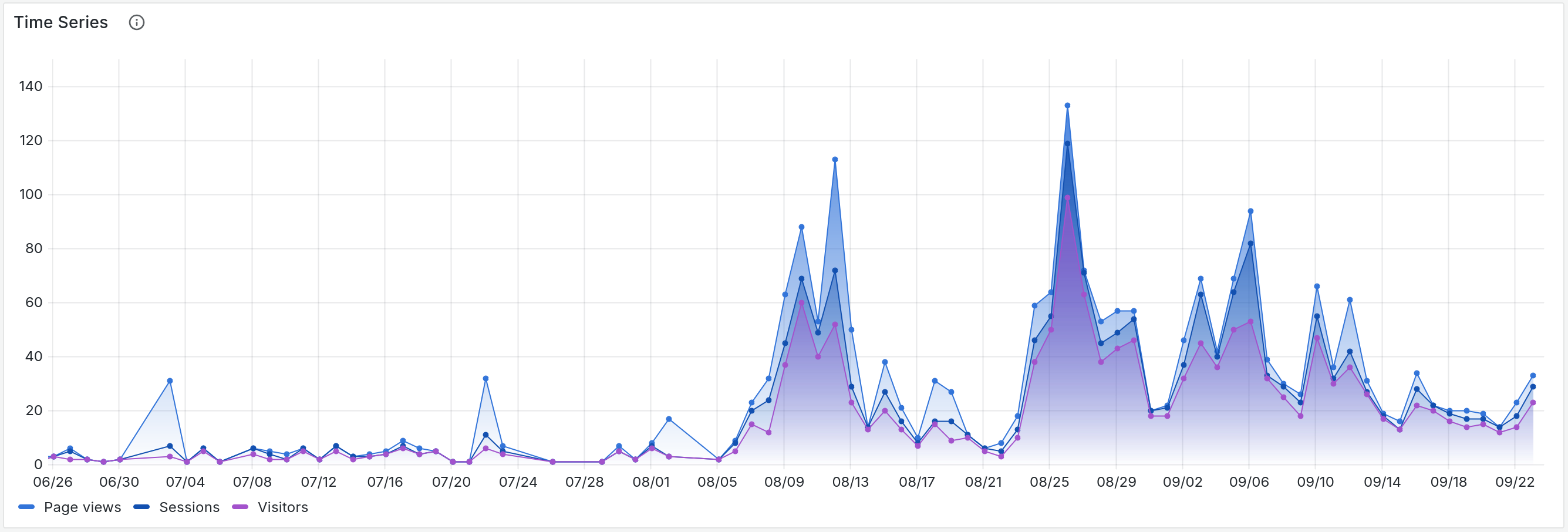
Time serie panel shows you visitors, sessions and page views over the selected period of time.
Sources section
Second section is made of two panels showing where your traffic is coming from.
Top sources
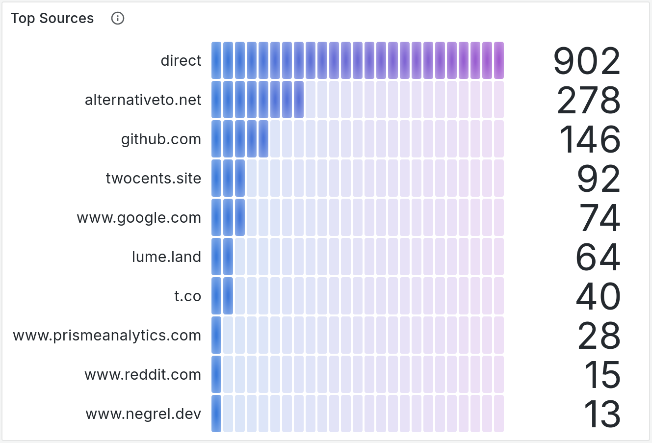
First panel is a bar gauge showing 10 most used sources.
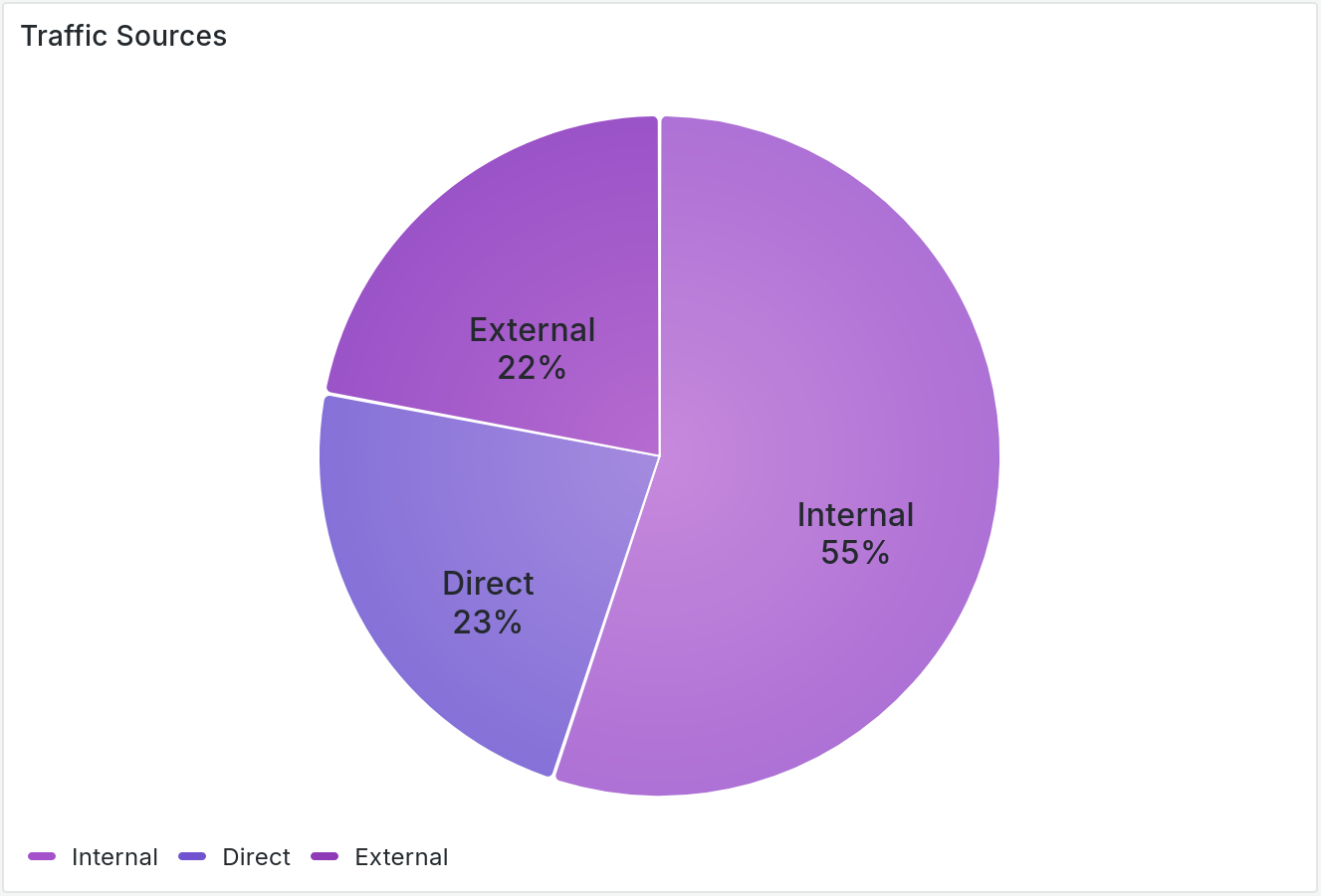
Traffic sources
Second panel is pie chart showing proportion of internal traffic (e.g. traffic from the same website) vs direct traffic vs external traffic (e.g. visitors coming from another website)
Top pages
This section shows most popular pages of you websites.
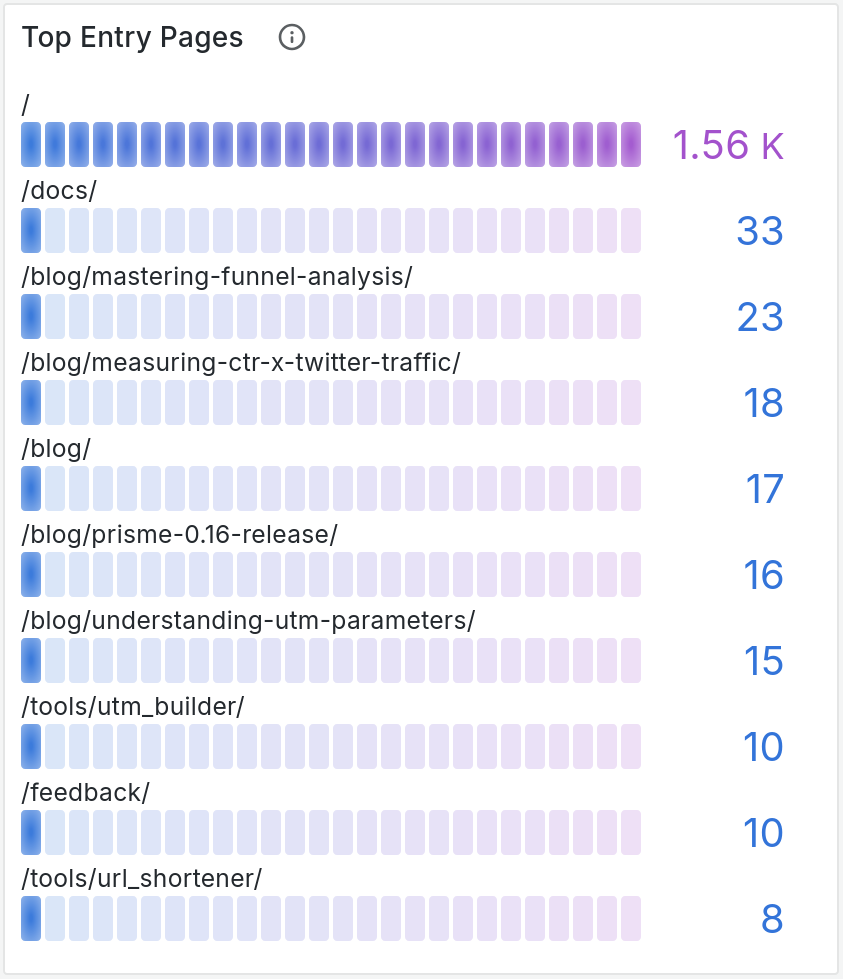
Entry pages
This bar gauge panels show the 10 most popular entry pages.
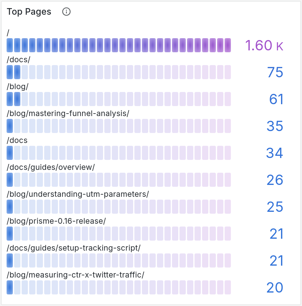
Top pages
This bar gauge panels show the 10 most popular pages.
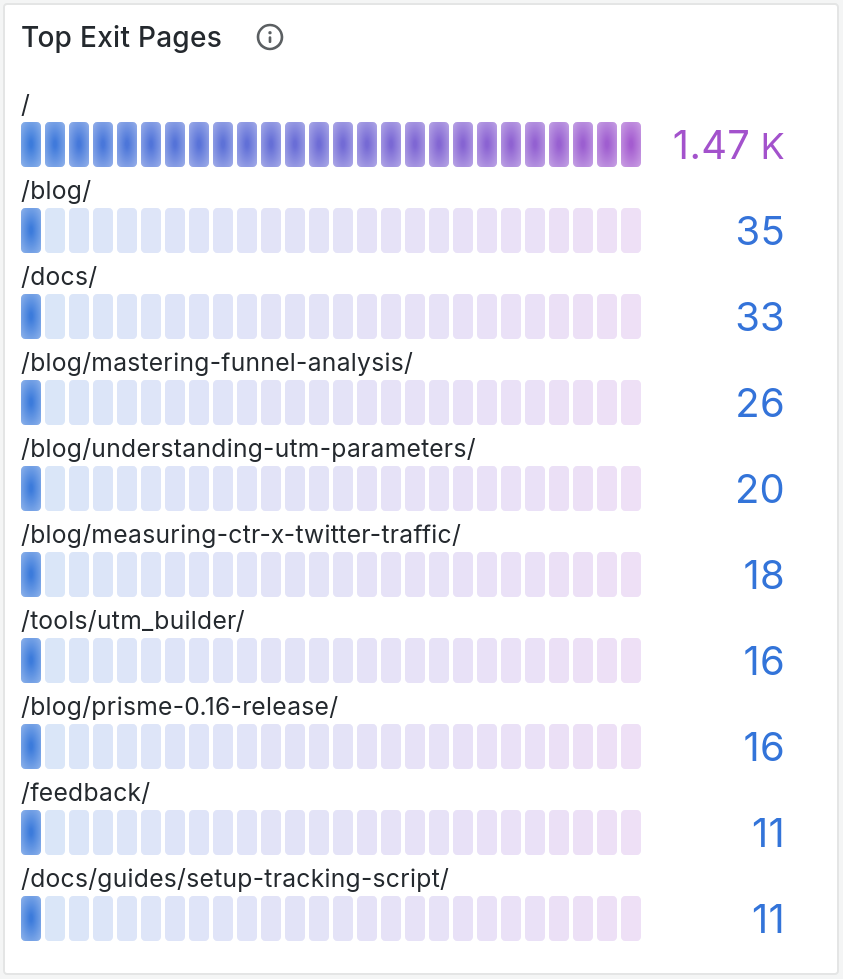
Exit pages
This bar gauge panels show the 10 most popular exit pages.
Location section
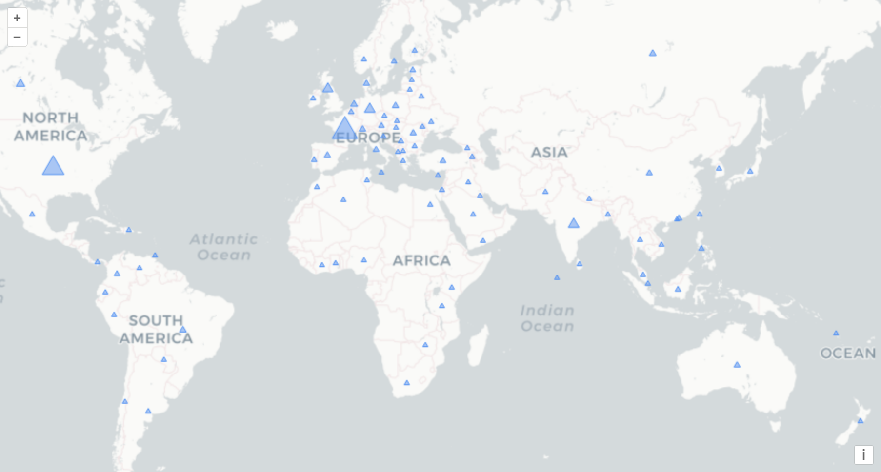
Location section shows visitors location.
Map
This map contains markers whose size is relative to the number of page views per country.
Top locations
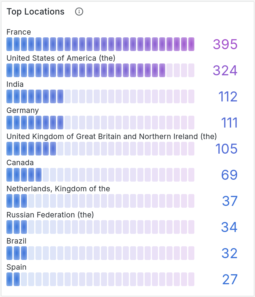
This bar gauge panels shows the 10 most popular visitors' location.
Devices section
Last section is about visitors' devices.
Browsers
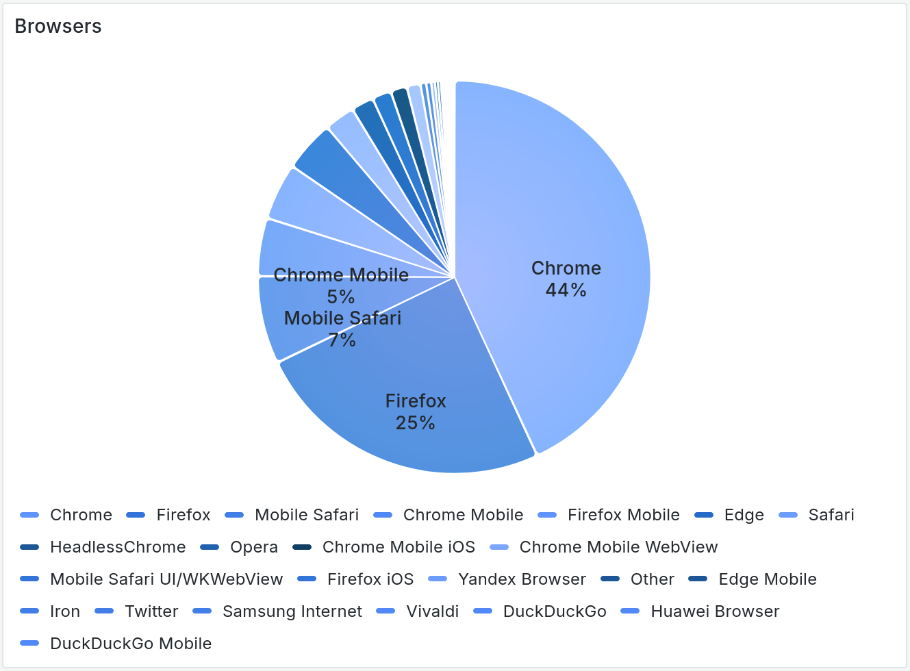
This pie chart shows visitors' browser family proportion.
Operating System (OS)
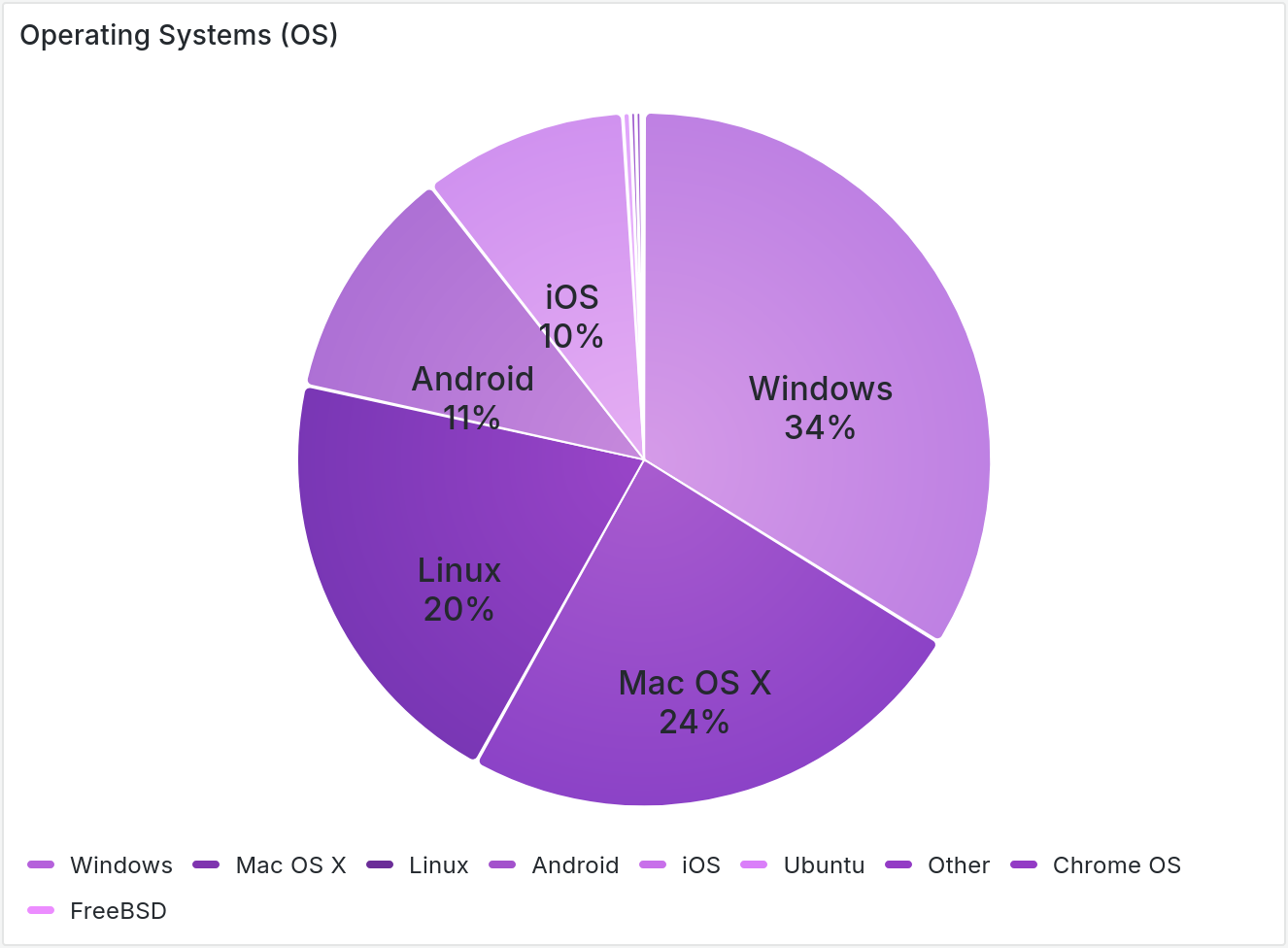
Second pie chart shows visitors' operating systems family proportion.
Custom events section
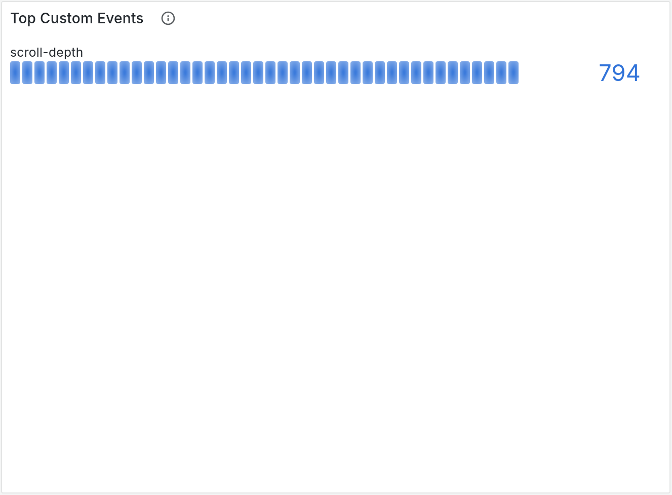
Custom events section shows your custom events.
Top custom events
This bar gauge panels shows the 10 most received custom events.